Correlation Scatterplots – Graphing Correlation Data (13-4)
Research By Design
Save 9 minutes
Original Video
Summiz
11 min
Original2 min
with Summiz5x
faster learning efficiencyBrief summary
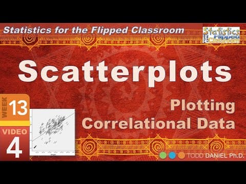
Correlation Scatterplots – Graphing Correlation Data teaches how to use SPSS to visualize and interpret relationships between variables like burnout, job satisfaction, and compassion fatigue through scatterplots, regression lines, and gender-based comparisons.

Categories with Correlation Scatterplots – Graphing Correlation Data (13-4)
Best quote from Correlation Scatterplots – Graphing Correlation Data (13-4)
As burnout increases, job satisfaction decreases.
—Research By Design

Add these5key ideas to your library
You can also export to
Notion, Obsidian or Markdown.
500+ Summaries
Access our growing library of high-quality content summaries
200+ Users
Join our community of dedicated learners and knowledge seekers
Loved Product
Everyone who has tried Summiz is delighted with the results
Quick Takes are free, forever. No billing setup required.
or
Generate free study notes from any YouTube video